portfolio, posters and flyers
Dream Gathering 2014 psychedelic flyer
May
Hey everyone! I’m back to Thailand after 2 years away from this land of smiles and gorgeous food)). Today I’d like to share some of my art with you. It’s a flyer I did for Dream Gathering 2014.
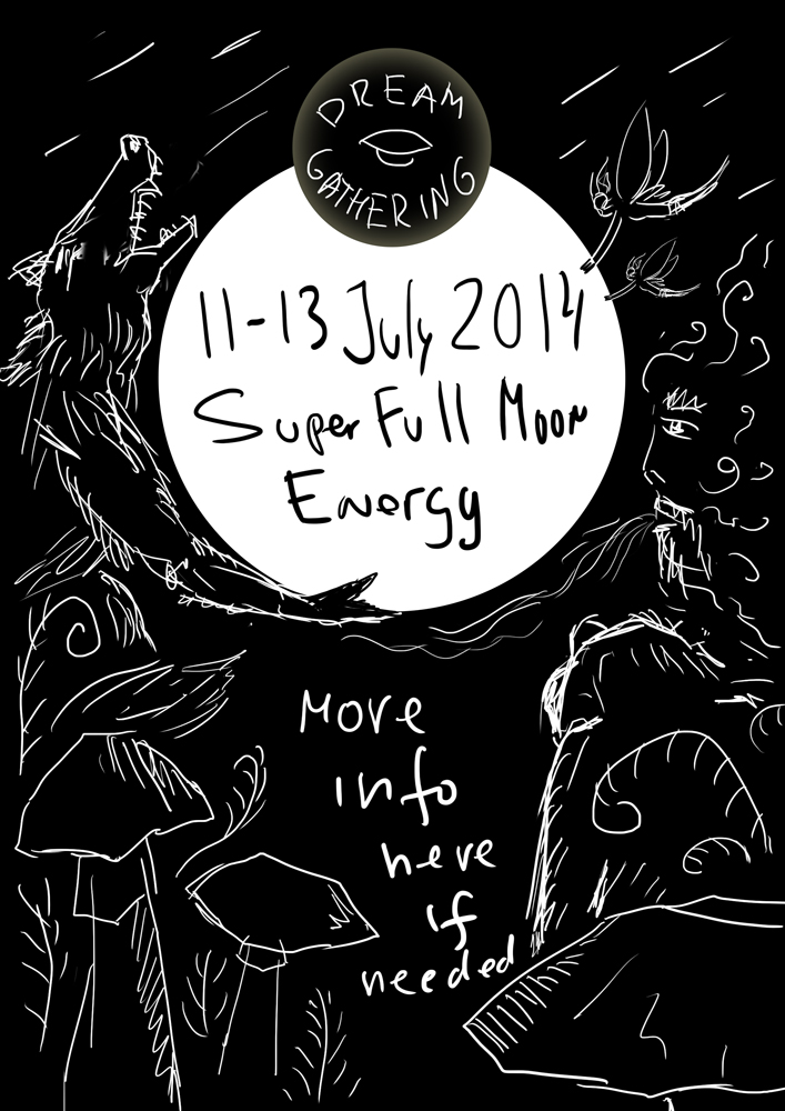
Here is the flyer’s sketch. I have already made the FB page’s cover and the guys from Dream Gathering wanted to continue this fairy theme so you can see a repeating pixie character and mushrooms.
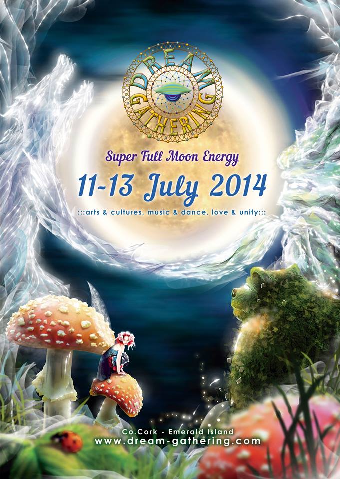
Here is the artwork.
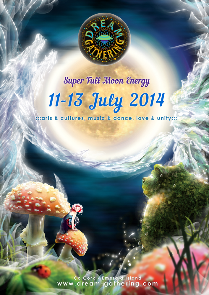
But after I’ve made it guys asked me to remove the black moon behind the logo. Below is the filial version. Still I find the previous design more attractive ‘cause there is more depth in it.
Here are some stock credits. The fairy photo can be found on DA. The rest (shrooms, ladybug, moon) came from sxc.hu.
If you like this post check out all of the Dream Gathering art posts!
I still find the second one better :)
The one without the black moon?)
:)
Yes, the one with a transparent background :) The logo looks like a part of the picture rather than a stamp on a flyer.
That’s what usually customers want to avoid for the marketing reasons ;)
Anyway it’s a matter of perception)
Yes, from my point of view, marketing imposes bad behavior to art, thus the last one has to struggle in order not to be solely a feeder but a source of beauty. However, it’s worth mentioning that among customers one can find a good one who hasn’t been spoiled by marketing and allows using a transparent background :)