freebies, portfolio, posters and flyers, tutorials
How to make a psychedelic trance party flyer

Jan
Hey people! This tutorial is about creating psychedelic trance music party flyers. I’m doing those from time to time. This is my last artwork I did for Earth Star. Below you’ll see 20 steps of how to do such design. Frankly this is a very brief tutorial, but I hope you’ll get the idea of how I did this design.
Stock you will need
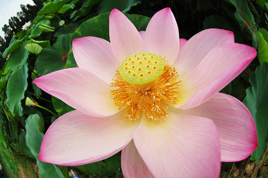
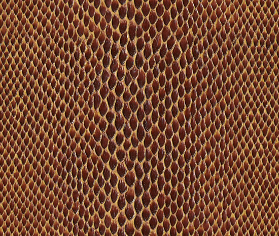
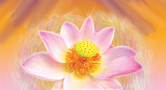
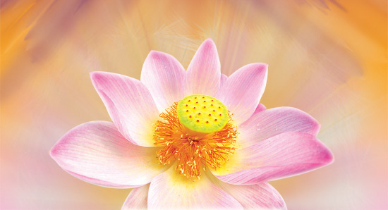
I did not use much photo stock below are the only two images (you can click on a image to grab it):
I’ve been also using a very cool brush set called “Good brush”. Even if you are not a digital painter I definitely recommend you to download these brushes.
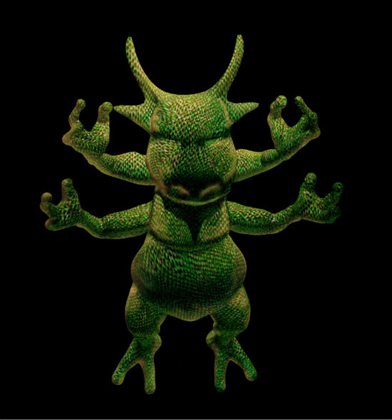
Step 0 – concept
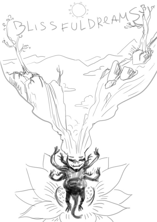
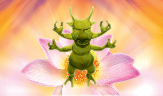
The name of the party is Blissful Dreams, so I came up with a mystic character dreaming of a world of waterfalls, mountains and trees.
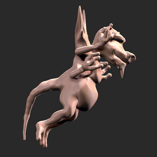
Step 1
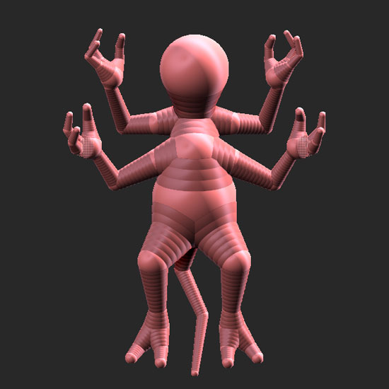
This might surprise you but yes, I made a simple z-sphere model in Zbrush. You can find some tutorials on this subject on Youtube. Sure I could draw this character in Photoshop, but I always wanted to try 3D art and this was a chance I could not miss. Frankly I’m a novice in 3D but I hope this will change some day.
Step 2
Here is the detailed model. I was using very primitive sculpturing techniques – mostly regular, move and soften brushes in Zbrush. After I make the model I export it to .OBJ file.
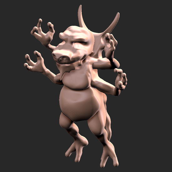
 Step 3
Here you can see the model imported in Photoshop and positioned the way I needed.
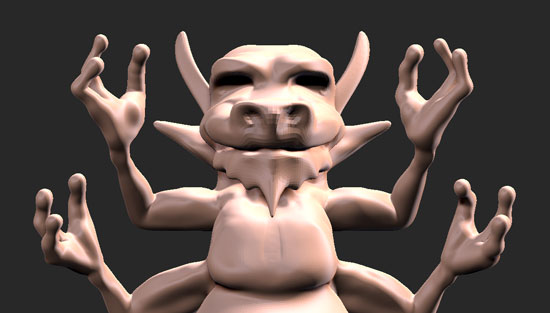
Step 4
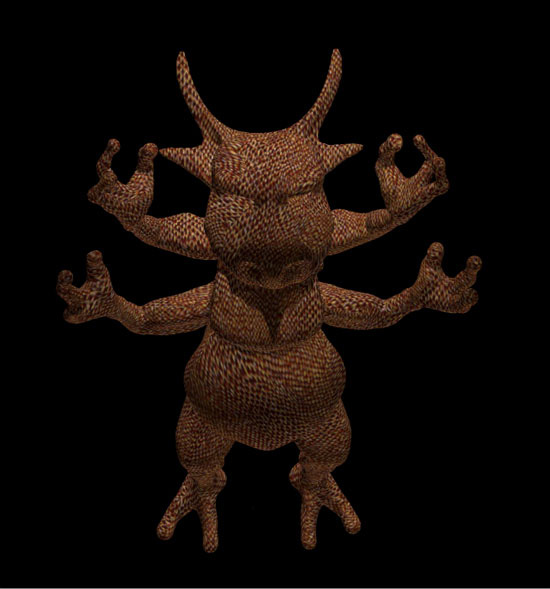
This was the first time I was using Photoshop’s CS5 3D features. So I’ve added the snake skin to the character.
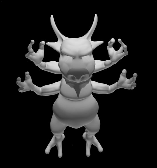
Step 5
I rasterized the 3D model so the computer can work faster. Next thing I did – changing the HUE (Cmd+U) and adjusted Levels (Cmd+L)
Step 6
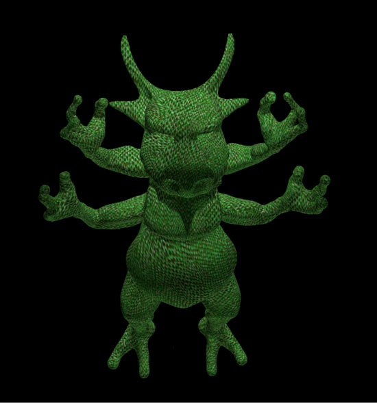
Made 2 more layers with light (both are clipping masks)
Step 7
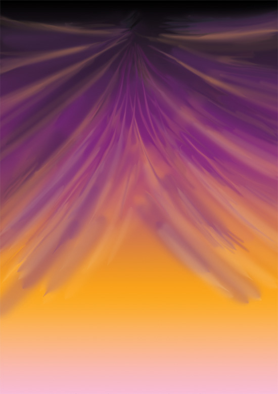
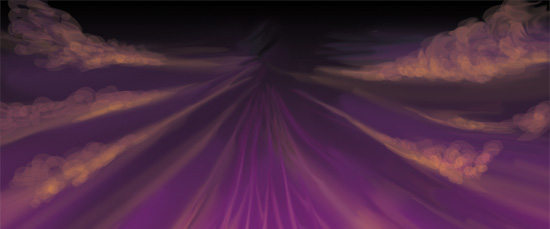
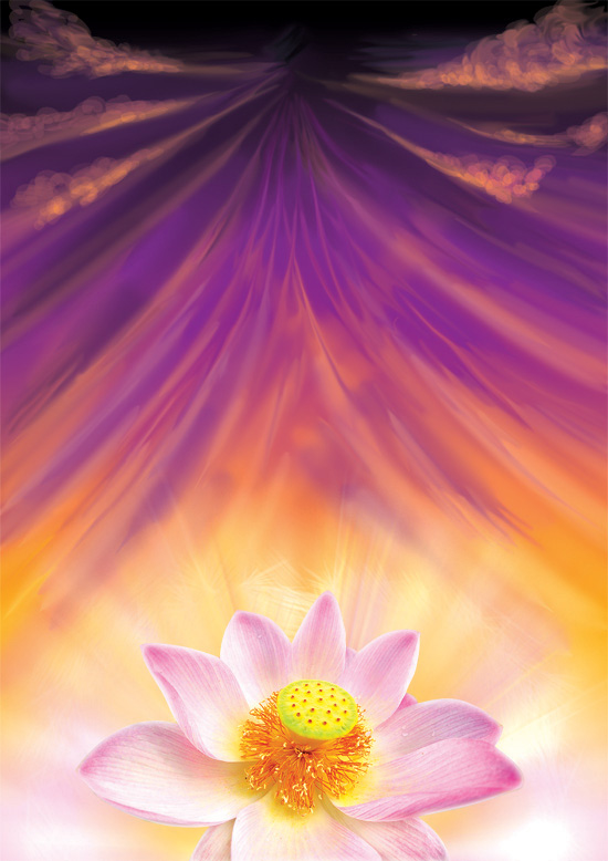
The technique I used for the background is very simple. First fill a new layer with any color, double click on it and add gradient overlay with 4 swatches – black, purple, orange and pink. Right click on the effect name on the layer panel and click Create Layer. Merge the gradient layer onto the original. Select a simple round Brush (B) with opacity set to 20-30 and harness set to 0. Use this brush to create the drapery effect. Use Smudge Tool (L) to blur the background a bit.
Step 8
Then I added some simple cloud-like shapes.
Step 9
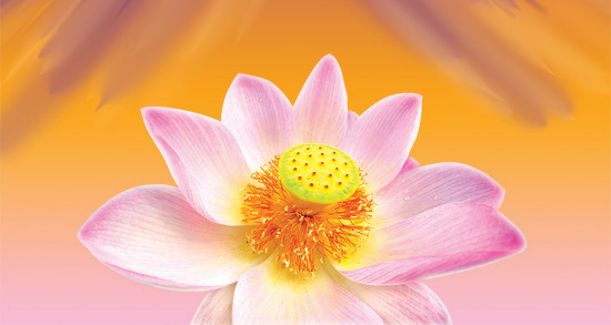
Copied and pasted the lotus photo. I usually use Pen Tool (P) to isolate the objects. Then I added some strokes under the flower in a new layer. I’ve used one of the brushes from Good brush set. Next thing I did is duplicated the strokes layer and used Radial Blur filter set to Zoom mode.
Step 10
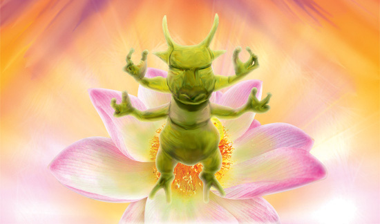
The image seem a bit too desaturated so I’ve fixed the levels (Cmd+L).
Step 11
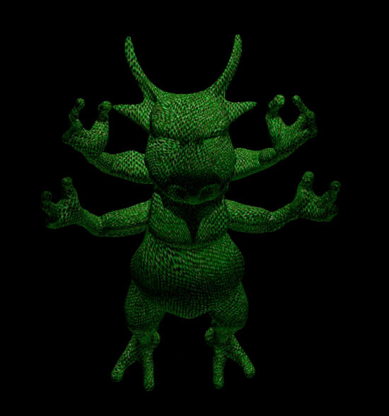
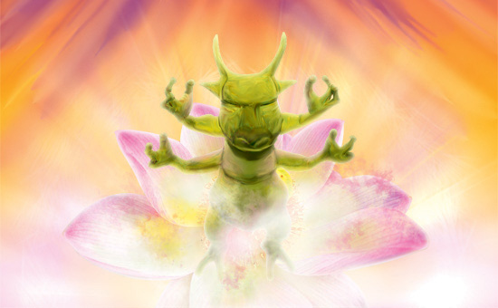
I did not like the texture of the creature so I used the Smudge Tool (L) to make it more painted-like. Next thing was adding more light and reflexes to the creature in separate layers.
Step 12
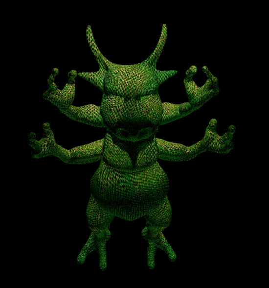
Then I’ve added green color shadow over the flower and some cloudy fog over the creature.
Step 13
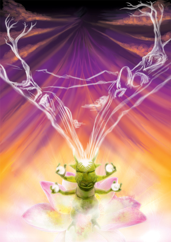
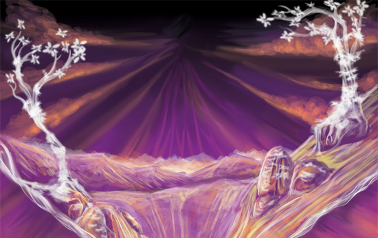
With the help of a simple Brush (B) and Smudge Tool (L) I’ve added a simple idea of a landscape on a separate layer.
Step 14
I painted the landscape with a transparent brush. I used the colors from the background so the landscape kind of merges into background.
Step 15
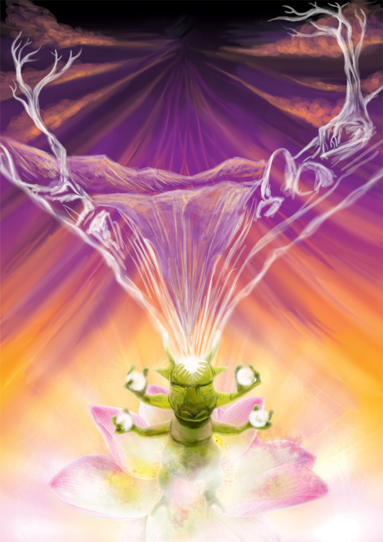
Adding a shade under the landscape makes it to stand out a bit.
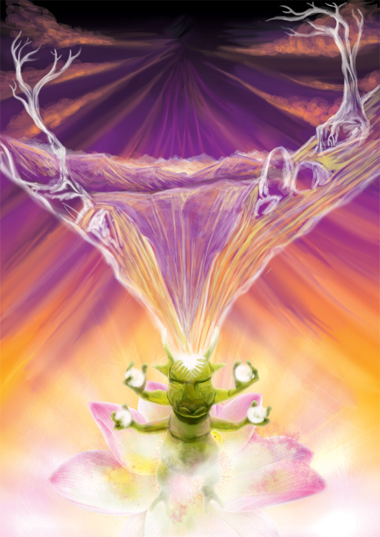
Step 16
Here I’ve just added some lightning details to the spheres the creature holds in his hands and some light to the rocks.
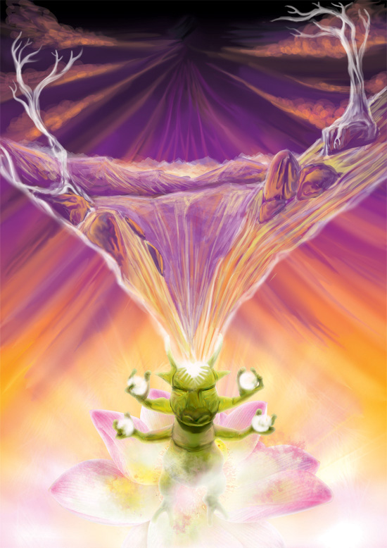
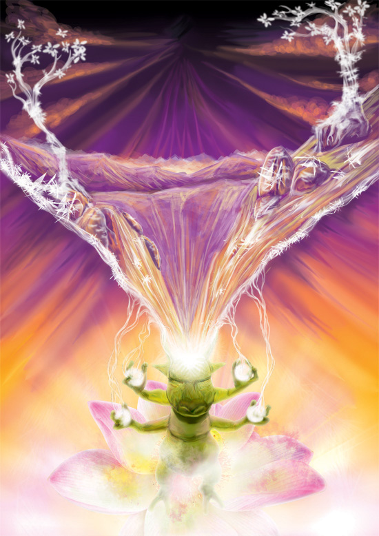
Step 17
Within the Good brush set there are some brushes to make the foliage and sparkles. This is how I’ve used ’em.
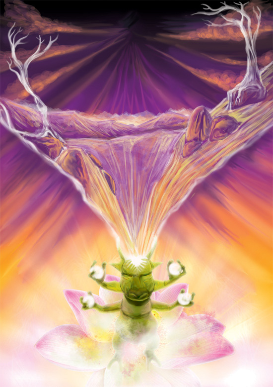
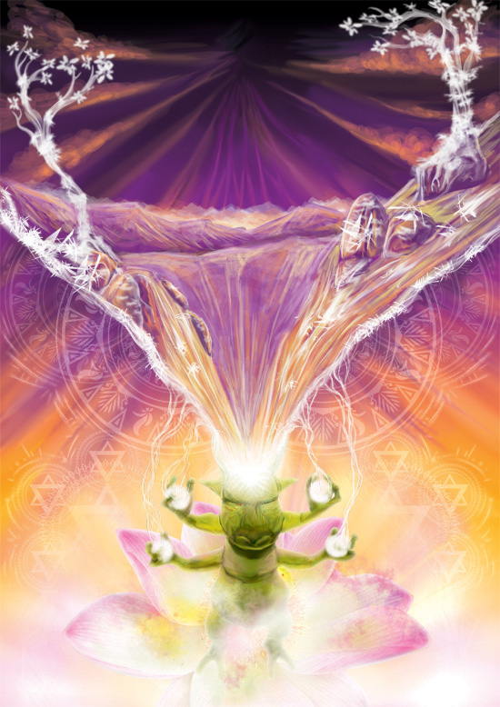
Step 18
As you might know I’m a big vector art fan so when it comes to ornaments I prefer using vector art software. These concentric elements will make a nice “magic” feel to the image. Some time ago I wrote a tutorial on creating such mandala-like compositions.
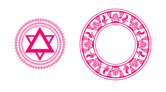
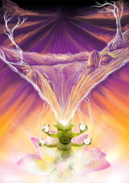
Step 19
I prefer keeping the pasted vector elements as smart objects so if I upsize them they are still high quality. You can easily change the color using layers effects – Color overlay and Opacity.
Step 20
The last step is adding text. This depends on how much information you need to put – what should stand out and what is less important. You can divide your text into logical groups and assign styles (colors, size, font face, letter spacing, etc) to them. I just won’t recommend you using more than two different fonts.
It looks like the end
Thanks for reading all the way down! Hope you’ve found out something new or at least learned about the free resources you can use. Speaking of free psychedelic art stuff – if you subscribe to my newsletter you’ll get instant access to my Psychedelic art stash – premium resources for psychedelic artists found only here.
Great tutorial man !! keep it up!
Thanks!) I surely will! :)
hey where can i find such clouds, and how do you manage to use the smudge tool with such precision
Hey! If you mean the clouds on the top of the flyer, I’ve simply painted ’em with a round brush tool with opacity set to 20-40%. And speaking of precision, it’s easy if you have a relatively big file (about 3000x4000px or more).